.brynnHart()
AI Technologist / UX Designer / Graphic Designer / UI Engineer

My background in medicine gives me an edge in healthcare UX, but I thrive anywhere that needs clarity from chaos. I call my design style cozy minimalism: warm, clean, and human-centered.
AI has been a throughline in my work—from evolving package designs with ML, to building sentry systems that catch PHI leaks in hospital networks, to crafting RAG-powered AI assistants that supercharge team productivity. I design and engineer systems that work with humans, not around them.

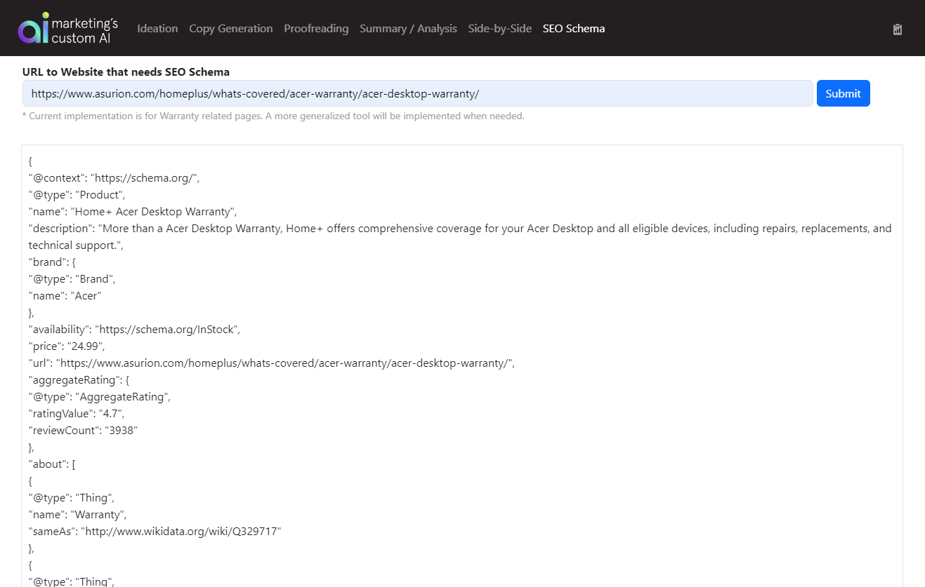
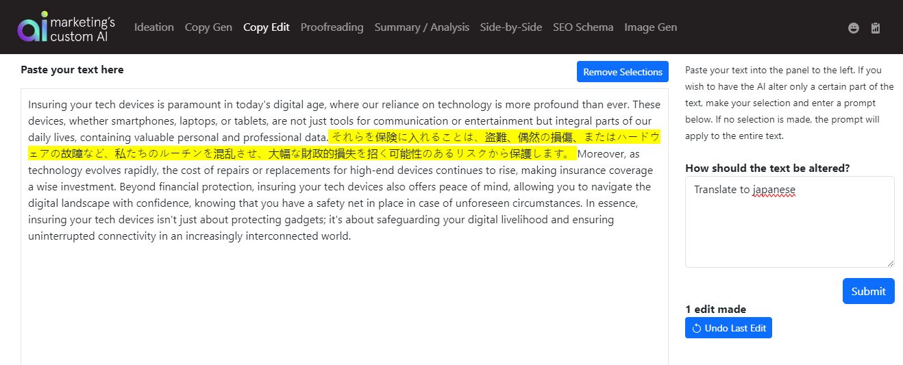
Building an Agentic AI System for Asset Generation
Tech: Python, CLIP, ChatGPT / Adobe Firefly Github: Code for the core AI asset generation Demo: Showing the command line AI generation outputDesigned an agent-driven automation system to generate, validate, and deliver creative assets at enterprise scale.
- Architected a multi-agent workflow (Watcher → Generator → Evaluator → Alert) to autonomously process incoming campaign briefs
- Built modular GenAI components for image generation, compliance enforcement, translation, and multi-ratio layout templating
- Implemented automated variant tracking with rules for asset sufficiency, diversity, and regeneration triggers
- Created a structured alerting model to produce human-readable status reports using model context protocols
Result: a scalable, Firefly-ready automation system that produces brand-safe creative variants with minimal manual oversight


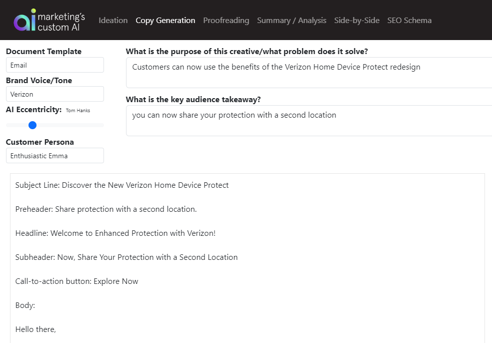

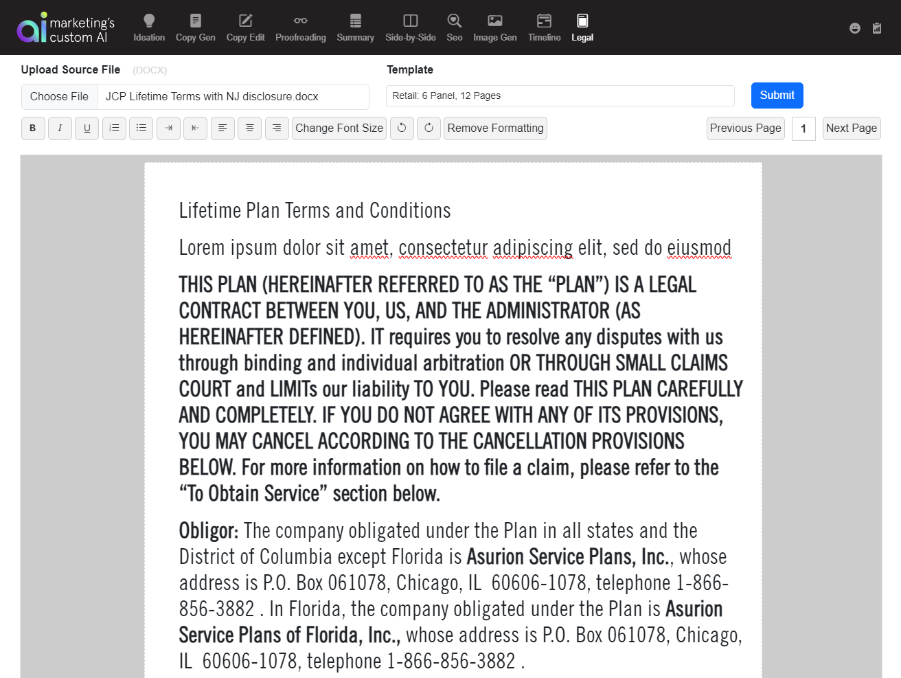
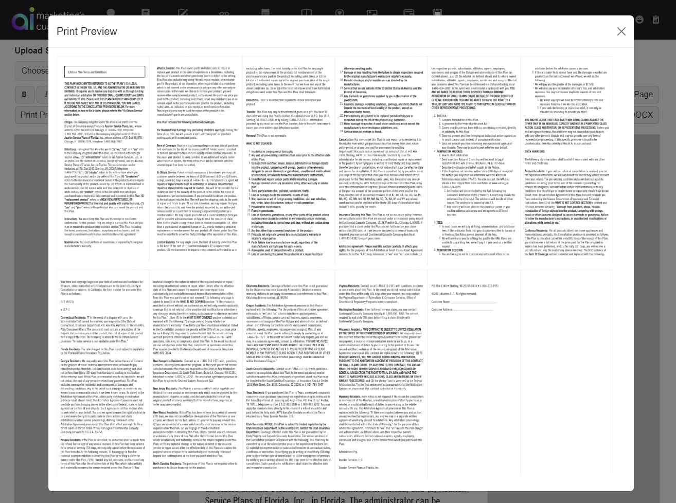
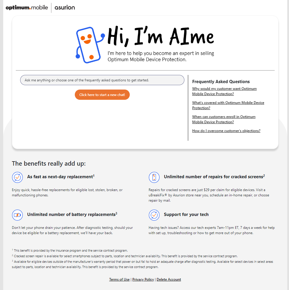
Custom Generative AI Tool Suite
UX: Figma
Tech: ChatGPT API, Azure AI, DALLE-3, Leonardo.ai, AWS
Built an internal suite of branded GenAI tools (writers, prompt composers, image gen, tone transformers) to streamline team workflows across content, support, and strategy.
- Led UX and frontend build, starting with user discovery to prioritize real-world use cases
- Used Azure AI + SharePoint to ground responses with internal docs (tone guides, policy, FAQs)
- Created flexible prompt frameworks to control tone, structure, and intent
- Built an intuitive, distraction-free UI that encouraged creative exploration
Now in daily use org-wide, saving teams hours weekly and leveling up output quality
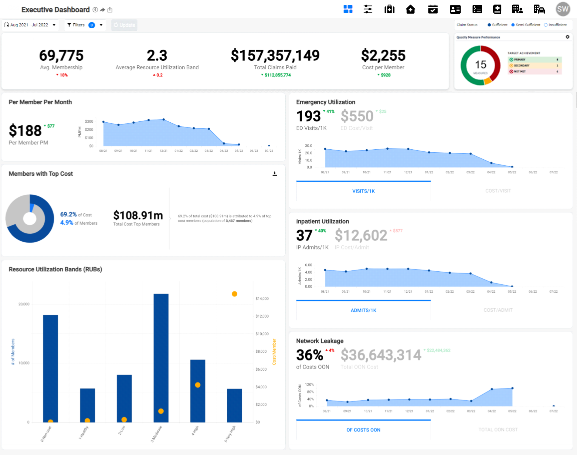
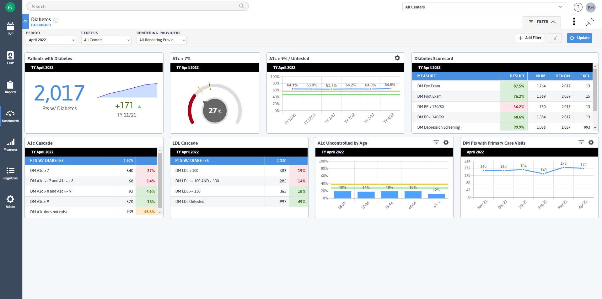
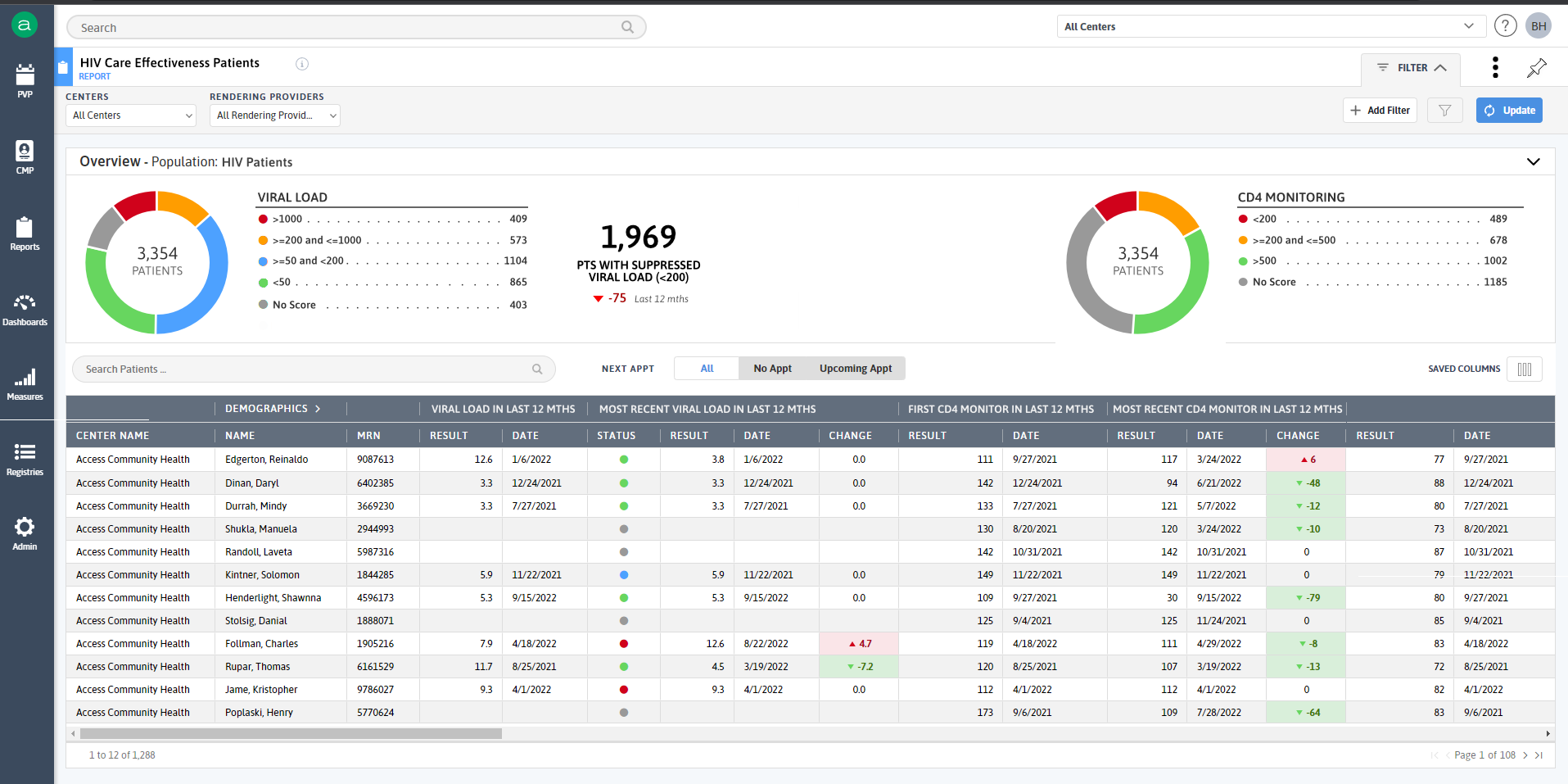
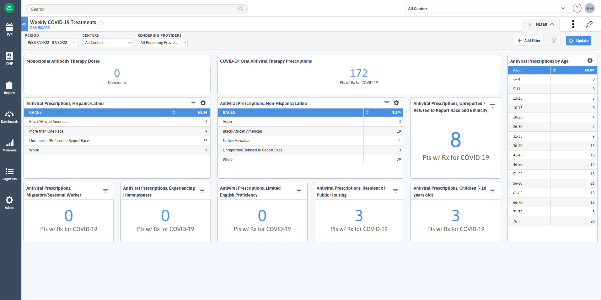
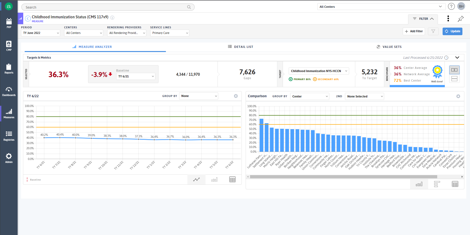
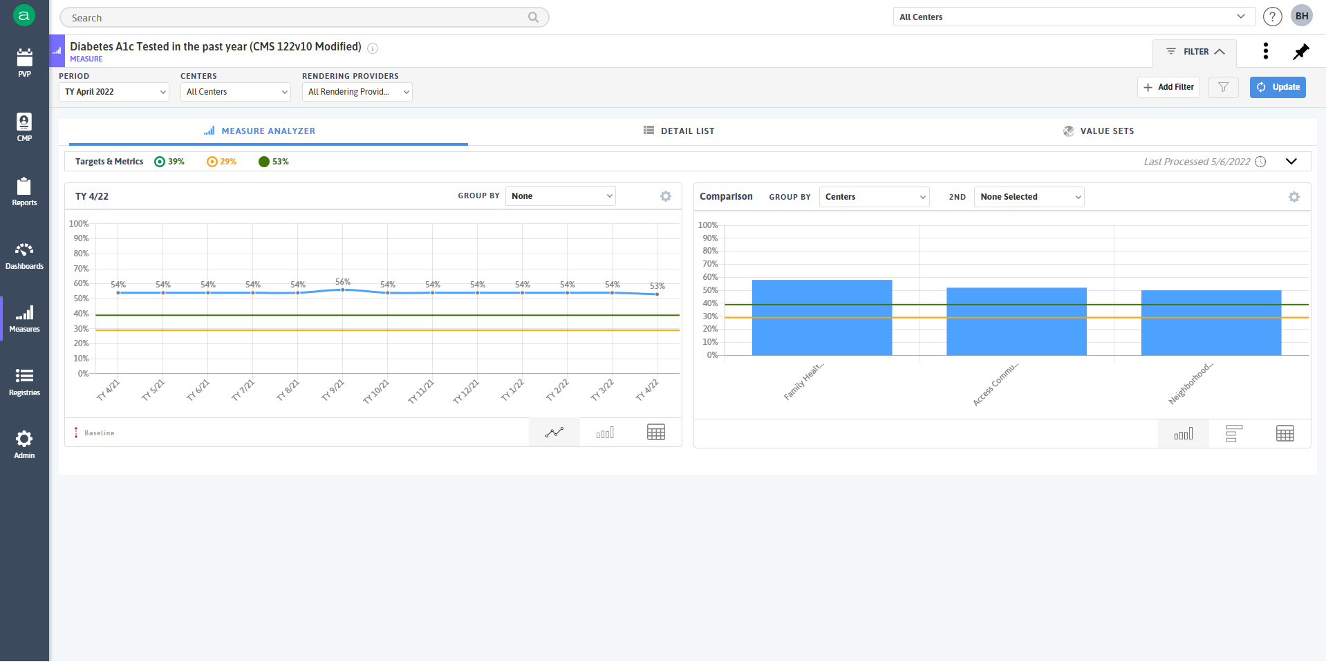
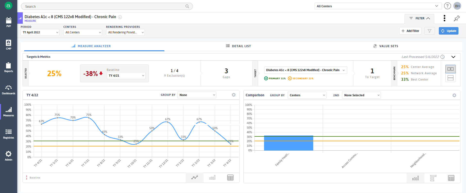
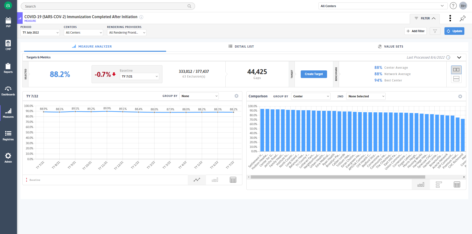
Healthcare Quality Analytics Dashboard
UX: Miro, Figma
Tech: D3, Tableau, Adobe Creative Suite
Designed a modular dashboard to help healthcare teams make sense of complex quality metrics and discharge patterns.
- Conducted persona-based journey mapping and stakeholder interviews
- Used Miro workshops to surface pain points in data comprehension
- Built D3 visualizations with clean hierarchy and accessibility at the core
- Prototyped in Tableau for early validation, then finalized in custom D3
Enabled faster, clearer decision-making from C-suite to care coordinators


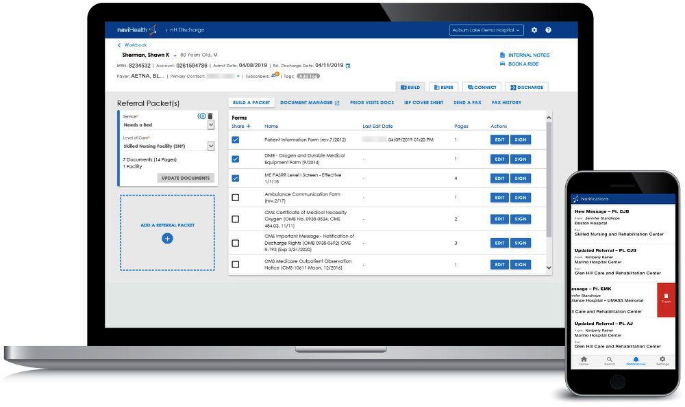
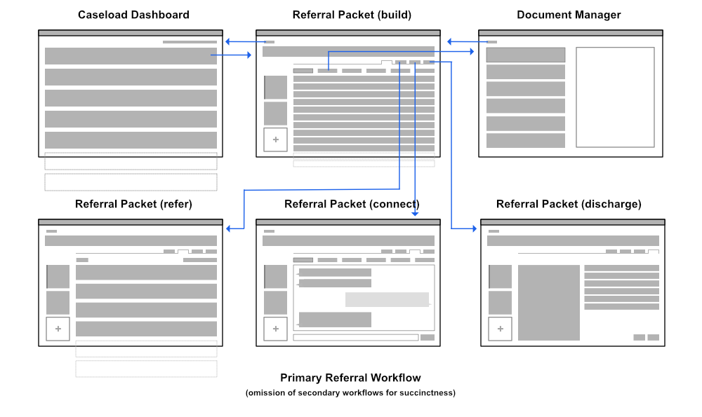
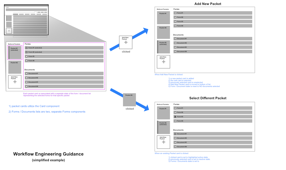
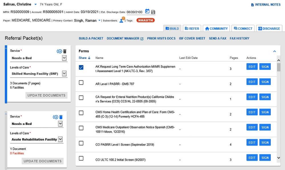
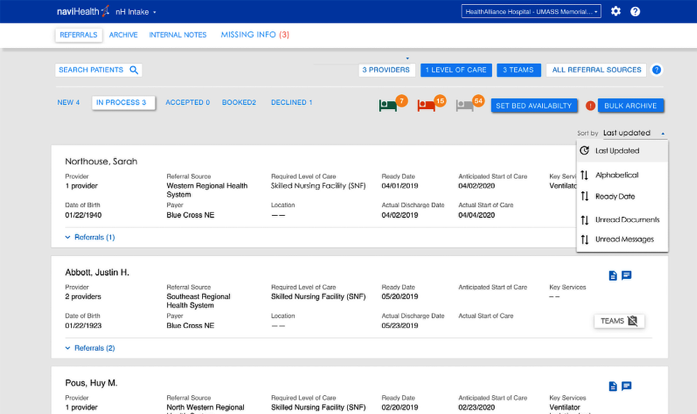
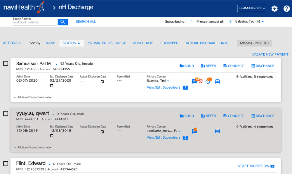
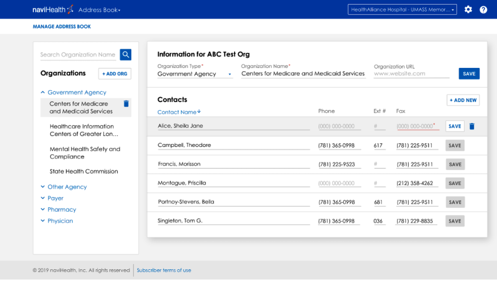

Hospital Patient Transition Platform
UX: Miro, Sketch
Tech: Angular 12, Bootstrap 4, React Native, Illustrator
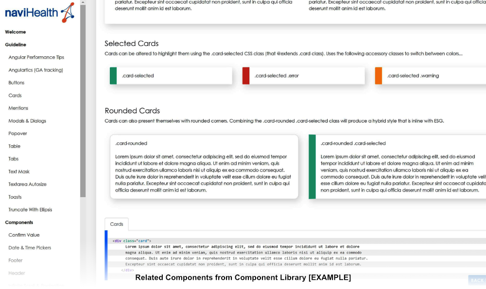
CHECK OUT THE COMPLETE DESIGN SYSTEM!
Redesigned discharge workflows to reduce patient readmission risks.
- Conducted field research with discharge nurses and case managers
- Pinpointed handoff errors from poor documentation and inaccessible plans
- Built situationally-aware UIs for both mobile and web, tuned for quick data entry
- Developed a full enterprise design system to unify the experience across platforms
Result: faster, safer handoffs with cross-platform consistency
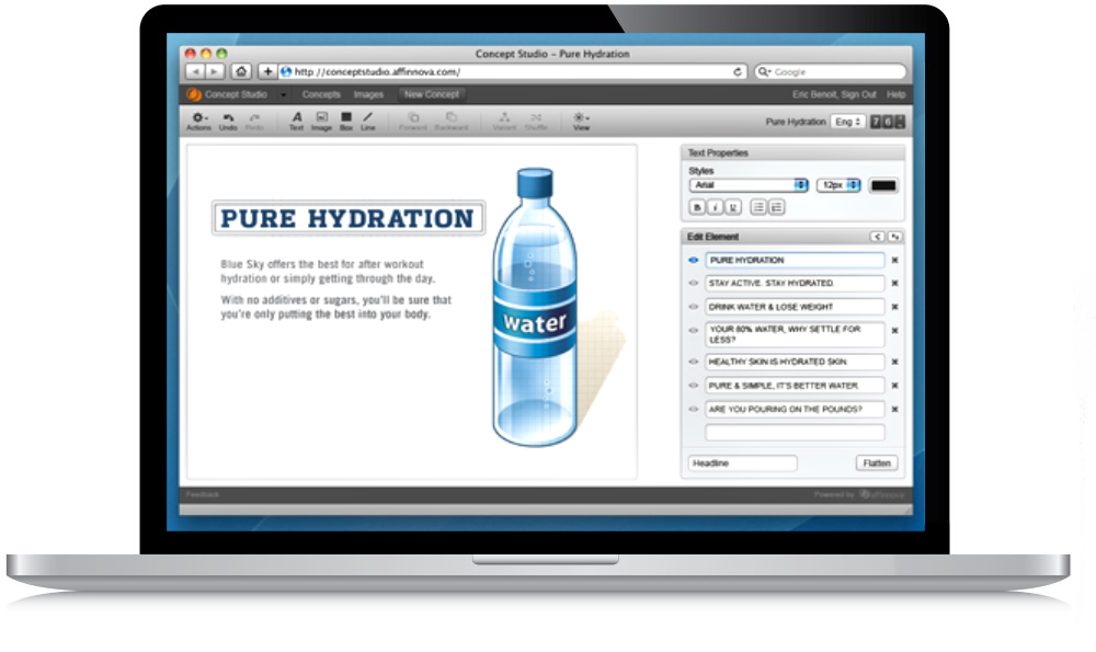
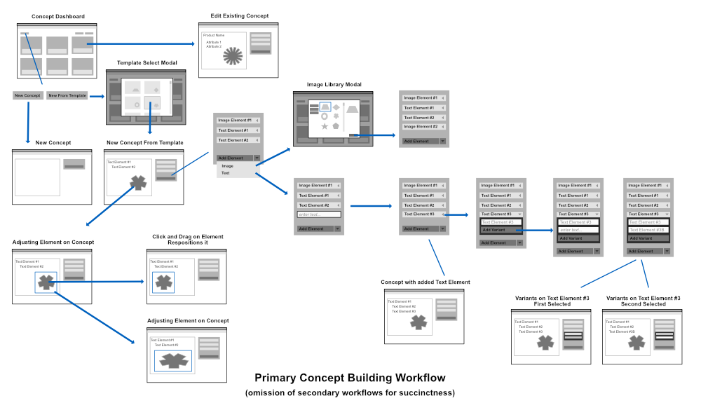
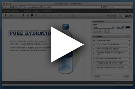
Market Research Stimuli Designer
UX: Whiteboard, InDesign
Tech: Custom JS, jQuery, Backbone.js, Illustrator
Rebuilt a legacy tool that powered AI-driven A/B tests for product preference studies.
- Partnered with researchers to identify usability blockers
- Replaced clunky forms with drag-and-drop WYSIWYG editor
- Built lightweight, modular frontend using Backbone.js + custom jQuery
- Delivered a faster, less error-prone workflow for running iterative studies
Cut setup time drastically and improved research velocity
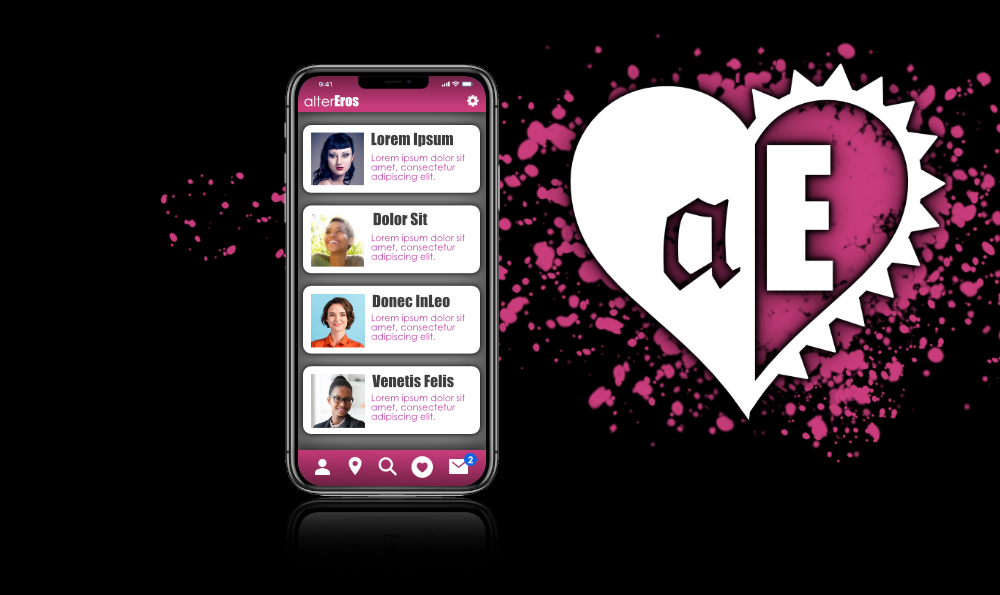
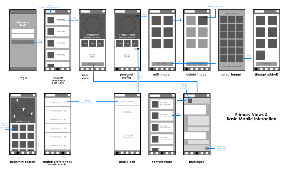

Matchmaking Mobile App
UX: Affinity Designer
Tech: Angular, Ionic, Affinity Photo
Created a new take on dating apps—centered on personality, not photos.
- Researched user fatigue with swipe-based apps to surface emotional pain points
- Designed a “question-first” matching flow to promote deeper discovery
- Built the entire mobile experience with calming visuals, gentle motion, and soft haptics
A more human approach to dating, with full-stack ownership from research to rollout